Showing posts with label Module 1. Show all posts

Saturday, 20 July 2019

M1_Process: Week 8 (18-24 June)

What is the definition of Contrast in Art?
Contrast is one of the main principles of art defined by art historians and critics. It is a strategy used by an artist to break up a work of art, and alter or even shatter its unity by inserting variation. In many ways, contrast is the opposite of the element of unity, in that it commands the viewer's attention by sheer force of its differences. 
Art historians and critics regularly include contrast as a main principle of art, although often in a number of different ways. Contrast is known by a range of terms, such as variety or variation, difference, unevenness, individuality, and novelty.

Contrast Paired with Unity


Contrast can be a matter of arranging opposite elements (light versus dark, rough versus smooth, large versus small), when the artist is working specifically to echo and repeat different levels of unity. In such artwork, contrasts can be paired colors which are chromatic opposites: in a work strictly adhering to unity those colors would be complementary. When the artist uses contrasting paired shapes such as two circles of different sizes, or a triangle and a star of the same size, contrast can be seen as opposite but partnered with the element of unity. 
One example of the kind of contrast that works hand and hand with unity is that of the classic women's suits of Coco Chanel. Chanel paired a unified set of contrasting colors—primarily but not exclusively blacks and whites—and rectangles and squares as a contrast to the unified whole of a woman's soft colors and shapes.

Antagonism of Color and Shape

Contrast can also be antagonist colors and shapes: Renaissance painters like Rembrandt and Caravaggio used the contrasting technique known as chiaroscuro. These artists set their subjects in a darkly lit room but picked them out with a single pool of contrasting light. In these types of uses, contrast does not express parallel ideas, but rather, sets aside the subject as unique or significant or even sanctified compared to its background. 
In its Gestalt sense, contrast is arousal-driving, or emotion-producing or -stirring. Contrasting areas in art can have high information content, and express complexity, ambiguity, tension, and variability. When opposing shapes are set next to one another, the viewer is often immediately drawn to the polarity of the images. What is the artist trying to convey with the difference? 

Measured or Controlled Contrasts

Contrasts can be measured, or controlled: extreme variety can make a piece into a chaotic unintelligible jumble, the opposite of unity. But sometimes that works. Consider Jackson Pollack's canvases, which are extremely chaotic and laid down in contrasting lines and blobs of color, but the end effect is rhythmic in composition and unified in all of its variety. 

So, in effect, unity and contrast are two ends of a scale. The overall effect of a composition located near the variety/contrast end would be described as "interesting," "exciting," and "unique."

Gestalt Principles

The Gestalt Principles are a set of laws arising from 1920s’ psychology, describing how humans typically see objects by grouping similar elements, recognizing patterns and simplifying complex images. Designers use these to engage users via powerful -yet natural- “tricks” of perspective and best practice design standards.

The Gestalt Principles – a Background

The Gestalt Principles of grouping (“Gestalt” is German for “unified whole”) represent the culmination of the work of early 20th-century German psychologists Max Wertheimer, Kurt Koffka and Wolfgang Kohler, who sought to understand how humans typically gain meaningful perceptions from chaotic stimuli around them. Wertheimer and company identified a set of laws addressing this natural compulsion to seek order amid disorder, where the mind “informs” what the eye sees by making sense of a series of elements as an image, or illusion. Early graphic designers soon began applying the Gestalt Principles in advertising, encapsulating company values within iconic logos. In the century since, designers have deployed Gestalt Principles extensively, crafting designs with well-placed elements that catch the eye as larger, whole images so viewers instantly make positive connections with the organizations represented.
The whole is other than the sum of the parts.

- Kurt Koffka
Gestalt psychologists argued that these principles exist because the mind has an innate disposition to perceive patterns in the stimulus based on certain rules. These principles are organized into five categories: Proximity, Similarity, Continuity, Closure, and Connectedness.

Gestalt Principles

Some of the most widely recognized Gestalt Principles include:
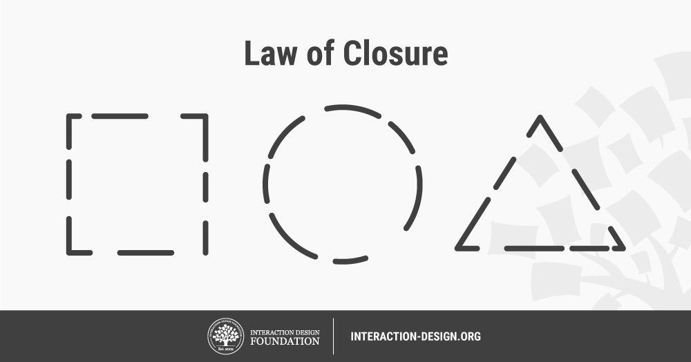
Closure (Reification): Preferring complete shapes, we automatically fill in gaps between elements to perceive a complete image; so, we see the whole first.
Common Fate: We group elements that move in the same direction.
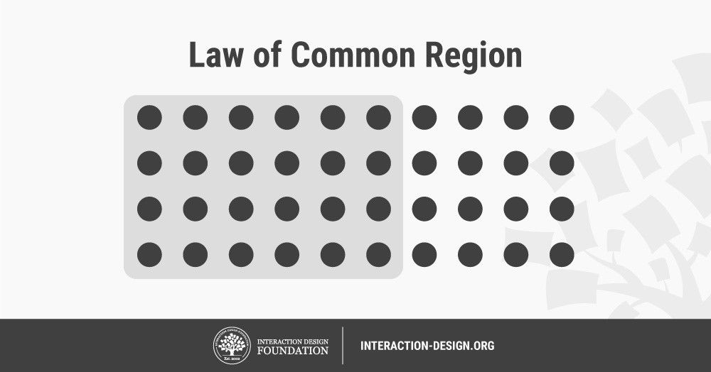
Common Region: We group elements that are in the same closed region.
Continuation: We follow and “flow with” lines.
Convexity: We perceive convex shapes ahead of concave ones.
Element Connectedness: We group elements linked by other elements.
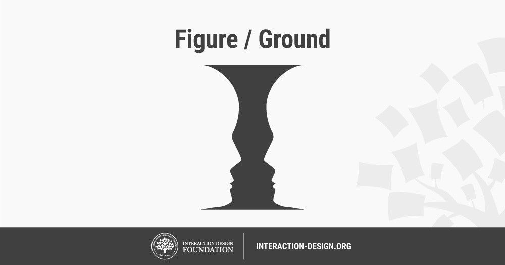
Figure/Ground (Multi-stability): Disliking uncertainty, we look for solid, stable items. Unless an image is truly ambiguous, its foreground catches the eye first.
Good Form: We differentiate elements that are similar in color, form, pattern, etc. from others—even when they overlap—and cluster them together.
Meaningfulness (Familiarity): We group elements if they form a meaningful or personally relevant image.
Prägnanz: We perceive complex or ambiguous images as simple ones.
Proximity (Emergence): We group closer-together elements, separating them from those farther apart.
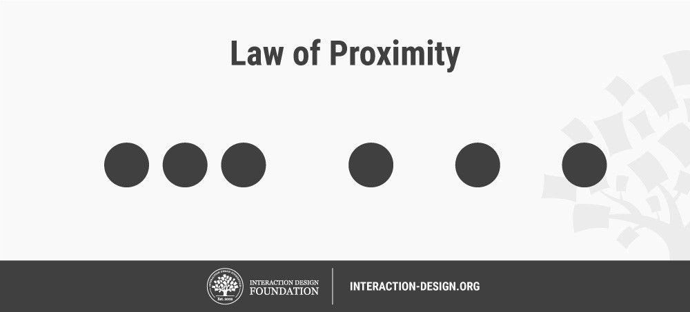
Regularity: Sorting items, we tend to group some into larger shapes, and connect any elements that form a pattern.
Similarity (Invariance): We seek differences and similarities in an image and link similar elements.
Symmetry: We seek balance and order in designs, struggling to do so if they aren’t readily apparent.
Synchrony: We group static visual elements that appear at the same time.

Gestalt Principles are in the Mind, Not the Eye

The Gestalt Principles are pivotal in UX design, notably in interfaces, as users must be able to understand what they see—and find what they want—at a glance. A good example are the principles of proximity and common region, as seen in the IDF landing page, below – where colors and graphics divide the page into separate regions. Without it, users will struggle to make associations between unrelated clustered-together items, and leave. For designers, the true trick of Gestalt is never to confuse or delay users, but to guide them to identify their options and identify with organizations/brands rapidly. 

Gestalt psychologists argued that these principles exist because the mind has an innate disposition to perceive patterns in the stimulus based on certain rules. These principles are organized into five categories: Proximity, Similarity, Continuity, Closure, and Connectedness.


Wednesday, 26 June 2019

M1 Process Wk 7 (June 11 - 18)

Research 13.6.2019

Eva Hesse
Finding inspiration in the human body, the random occurrence, the process of improvisation, and the liberating qualities of nontraditional materials such as industrial felt, molten lead, wax, and rubber, these artists mined a new aesthetic sensibility variously known as Anti-Form, Post-Minimalism, or Process art.
During her brief career Hesse contributed to this radical undermining of artistic convention with her abstract yet sensual sculptural works. She rejected the standard attributes of monumental sculpture—volume, mass, and verticality—in favor of eccentric forms made from rope, latex, and cheesecloth, all of which decompose with time. Her goal, she explained, was to portray the essential absurdity of life. In formal terms, this theme was realized through a wedding of contradictions: “order versus chaos, stringy versus mass, huge versus small,” in the artist’s words. Acutely aware of the challenges faced by a female artist in a predominantly male environment, Hesse may have utilized such formal opposites as a metaphor for her own position in the art world and to emphasize the inherent strength of flexibility and vulnerability.
Expanded Expansion is a sculptural embodiment of opposites united. Both permanence and deterioration operate in the piece: fiberglass poles—rigid, durable entities—are juxtaposed with fragile, rubber-covered cheesecloth. While its height is determined by the poles, the width of the piece varies with each installation; like an accordion or curtain, it can be compressed or extended. Its repetitive units echo the programmatic seriality of Minimalism, but here they accentuate Hesse’s desire to illuminate her view that “if something is absurd, it’s much more exaggerated, more absurd if it’s repeated.” The very redundancy of the title reinforces this idea.
Lynda Benglis
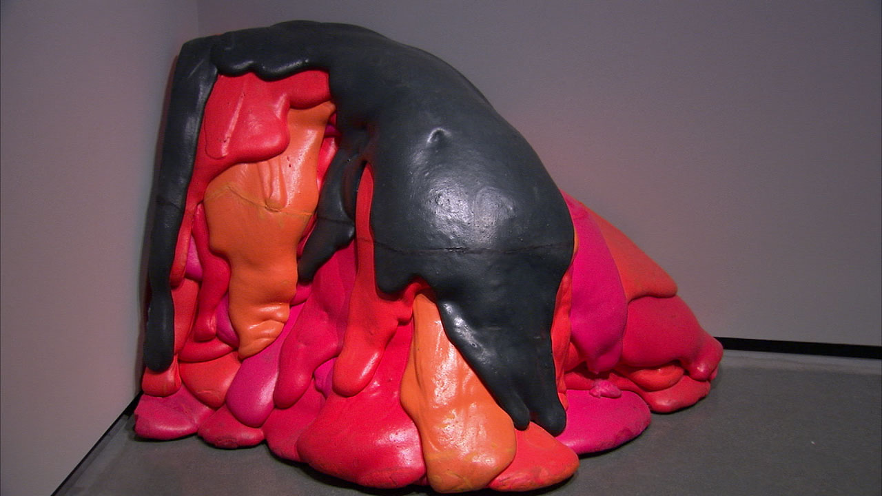
A pioneer of a form of abstraction in which each work is the result of materials in action—poured latex and foam, cinched metal, dripped wax—Lynda Benglis has created sculptures that eschew minimalist reserve in favor of bold colors, sensual lines, and lyrical references to the human body. But her invention of new forms with unorthodox techniques also displays a reverence for cultural references that trace back to antiquity. Often working in series of knots, fans, lumps, and fountains, Benglis chooses unexpected materials, such as glitter, gold leaf, lead, and polyurethane. In more recent works, she explores diverse cultural heritages (Indian architecture, Greek statuary, Chinese ceramics), translating ancient techniques and symbols for use in contemporary contexts. In her early adoption of video, Benglis introduced feminist, biographical, and burlesque content to structuralist narratives.


Lisa Firer: "Going to Pieces without Falling Apart" 
(with thanks to Mark Epstein
In this series of vessels, I explore what it means to feel a sense of cohesion, the sense that we are held together by the force of life in a quite miraculous way: body, mind and spirit. Some are created using separate pieces of clay that come together to form a vessel. In much the same way, we as beings, are a combination of many fragments that cohere to form vessels capable of holding such depth, creativity and beauty. We are layered, we are patterned, we are complex , we are beautiful. Other vessels are very loosely formed, with a softness that seems like it could collapse but is in fact in it’s fired state, contained and strong. We are wobbly, we are imperfect, we are unique, we are soft, we are strong.
This work is informed by my meditation practice and a direct exploration of what holds us together. I am finding that the only continuity that feels true is an open, spacious, loving connection, as best as possible, moment to moment, and breath by breath, to myself, to others and to the world. When so much threatens to pull us apart, these vessels remind me of our inherent wholeness.
I started working in porcelain in 2000 at the DK-SA artist-in-residency programme at the International Centre for ceramics, Skaelskor, Denmark. I have continued to work predominantly in this medium for the past 10 years. I work conceptually with the process of enlightenment and use the light transferring qualities of porcelain to explore this. The juxtaposition of the strength of this high fired clay and the delicacy of it when rolled very thin are also symbolic for me of the human condition, states of great strength and states of fragile vulnerability.

Karen LaMonte
The contours of valleys and peaks.
The attention to detail is amazing!

 Karen LaMonte is an American artist known for her life-size sculptures in ceramic, bronze and cast glass as well as her large scale monotype prints. Her art deals largely with the central themes of beauty and loss, exploring the fragility of the human condition through a sartorial lens. LaMonte also began investigating the use of ceramic in her sculptures at the European Ceramic Work Centre and was the recipient of the Corning Museum of Glass/Kohler Arts Center Joint Residency for working with ceramic and glass.

Terminology

Semiotic: is the study of works of art signs and symbols, either individually or grouped in sign systems that can give us more insight from the work source and meaning. All painters work in a pictorial language by following a set of standards, basics and rules of picture-making.

I found this diagram to be very helpful in understanding the principles of semiotics. 

Art Practice

Following on from the previous week's exploration of black/white tones.
 I painted on half of the canvas white, masked it with tape and painted the other side black. One it was completely dry and using a piece of fraying cloth I repetitively "whipped" the canvas, first the black half and then the white. My hand and arm got covered in red paint too!
I continued to build up colour continuously striking the canvas (the white side) one hundred times. Once completely dry I carefully peeled off the masking tape to expose the unmarked white strip (line)

Masking tape resist/black paint
The first attempt of masking wasn't successful. I used way too much masking tape in multiple directions not thinking about the challenges in removing the tape!

Masking tape on canvas support/black paint
Here I have applied gesso and white paint to the canvas support. Once dry, I have masked the support with tape. A small blob of black paint dropped on the centre appears to "float" on the surface. After spreading the paint across the canvas and allowing it to dry I carefully peeled off the tape revealing the white paint.

Masking tape on canvas support/black and red paint


 Sand sculptures/ Sand Art
Inspired by the above images....and reconnecting with "my inner child" I was reminded about the ability of making sculptures with sand. I had planned on going out to Ruakaka but my car need repairs and I advised against driving it until it was fixed.

 The damp sand did NOT want to slide out of the plastic tumbler!
The wet sand didn't drizzle the way beach sand does to which I came to the conclusion what one can do with ocean sand and water, one can't with river/tap water.

Continuing on from the week before with the leaves. My attempt to adhere them to wallpaper so I could "hang them up" kind of failed...
Leaves, on paper

Tuesday, 25 June 2019

M1 Process: Week 6 (3rd June)

Research/Reading

Minimalism - minimalist art offers a highly purified form of beauty. It can also be seen as representing such qualities as truth (because it does not pretend to be anything other than what it is), order, simplicity and harmony.

Kim de Ruysscher is known for his impressive sculptures and installations: products of calculated perfection, emphasizing the banality of everyday life.
Read about The science of crumpled paper                                     

My study of crumpled paper - tossed and photographed repetitively.
This week I decided to experiment crumpling and tossing newspaper. As I lay on the floor, the reflection of colour and shapes was the first thing I noticed. 
At times the paper appeared to be floating but
 also gently resting on the floor surface.
I reduced the saturation so I could observe the lines, tones and shapes 
Next I observed the lines, shapes and tones of the leaves.
Leaves - threaded and strung up on wire
                                                                     Leaves - stacked
Lines of Reflections
Leaves - Highly Strung


Friday, 21 June 2019

M1: Process Week 5 (27 May)

Phone call with Dane 10.45 am Tuesday 27 May

Things we talked about: Acknowledging what you and the work is doing


ReSEARCH

Drawing, Painting and Sculpture - print outs


SCLERODERMA OF PAUL KLEE, PART I: THE AFFECT OF THE DISEASE ON THE MAN AND HIS ART

ACTION PAINTING

Artists
Franz_Kline: Large brush strokes
Franz-kline/artwork

After reading up about Frank Kline's painting techniques and watching some YouTube videos I felt very inspired to experiment with large brush, strokes something I've not done before. It was so very liberating and freeing!
Then I squirted in a swirling motion the remaining white paint I had left in a tube. As the paint ran out, it came in spurts and splodges, creating interesting patterns over the paper. 
Whereas the paint initially flowed in a fine stream, as it ran dry it fell as globules which was most interesting to observe.
Finally, I took a clean paint brush and with a sweeping motion, swipe it across the white paint.
I love the energy it created!
The next idea I had was to pour red onto the black and white marks. By diluting the paint with a little water in a cup with a small lip, I found it easier to tip out. The mess it made as it splattered was astounding and had me panicking and running out to grab some wet rags to mop up the paint on the floor and walls!
I was intrigued to notice how stressed it (the mess on the floor/walls) made me feel, but loved all the patterns made on the by the splattered red paint. 
When it came to editing the images for loading on the TLC workroom I had a bit of fun rotating and mirroring the photos. To me, the cup appears to be floating in mid-air.
Here, I drizzled red paint in a continuous line striking out the letters of my name. Not sure why, I think subconsciously because it felt irrelevant because letters are representational symbols.