
What is the definition of Contrast in Art?
Contrast is one of the main principles of art defined by art historians and critics. It is a strategy used by an artist to break up a work of art, and alter or even shatter its unity by inserting variation. In many ways, contrast is the opposite of the element of unity, in that it commands the viewer's attention by sheer force of its differences.

Art historians and critics regularly include contrast as a main principle of art, although often in a number of different ways. Contrast is known by a range of terms, such as variety or variation, difference, unevenness, individuality, and novelty.
Contrast Paired with Unity
Contrast can be a matter of arranging opposite elements (light versus dark, rough versus smooth, large versus small), when the artist is working specifically to echo and repeat different levels of unity. In such artwork, contrasts can be paired colors which are chromatic opposites: in a work strictly adhering to unity those colors would be complementary. When the artist uses contrasting paired shapes such as two circles of different sizes, or a triangle and a star of the same size, contrast can be seen as opposite but partnered with the element of unity.
One example of the kind of contrast that works hand and hand with unity is that of the classic women's suits of Coco Chanel. Chanel paired a unified set of contrasting colors—primarily but not exclusively blacks and whites—and rectangles and squares as a contrast to the unified whole of a woman's soft colors and shapes.
Antagonism of Color and Shape
Contrast can also be antagonist colors and shapes: Renaissance painters like Rembrandt and Caravaggio used the contrasting technique known as chiaroscuro. These artists set their subjects in a darkly lit room but picked them out with a single pool of contrasting light. In these types of uses, contrast does not express parallel ideas, but rather, sets aside the subject as unique or significant or even sanctified compared to its background.
In its Gestalt sense, contrast is arousal-driving, or emotion-producing or -stirring. Contrasting areas in art can have high information content, and express complexity, ambiguity, tension, and variability. When opposing shapes are set next to one another, the viewer is often immediately drawn to the polarity of the images. What is the artist trying to convey with the difference?
Measured or Controlled Contrasts
Contrasts can be measured, or controlled: extreme variety can make a piece into a chaotic unintelligible jumble, the opposite of unity. But sometimes that works. Consider Jackson Pollack's canvases, which are extremely chaotic and laid down in contrasting lines and blobs of color, but the end effect is rhythmic in composition and unified in all of its variety.
So, in effect, unity and contrast are two ends of a scale. The overall effect of a composition located near the variety/contrast end would be described as "interesting," "exciting," and "unique."
Gestalt Principles
The Gestalt Principles are a set of laws arising from 1920s’ psychology, describing how humans typically see objects by grouping similar elements, recognizing patterns and simplifying complex images. Designers use these to engage users via powerful -yet natural- “tricks” of perspective and best practice design standards.
The Gestalt Principles – a Background
The Gestalt Principles of grouping (“Gestalt” is German for “unified whole”) represent the culmination of the work of early 20th-century German psychologists Max Wertheimer, Kurt Koffka and Wolfgang Kohler, who sought to understand how humans typically gain meaningful perceptions from chaotic stimuli around them. Wertheimer and company identified a set of laws addressing this natural compulsion to seek order amid disorder, where the mind “informs” what the eye sees by making sense of a series of elements as an image, or illusion. Early graphic designers soon began applying the Gestalt Principles in advertising, encapsulating company values within iconic logos. In the century since, designers have deployed Gestalt Principles extensively, crafting designs with well-placed elements that catch the eye as larger, whole images so viewers instantly make positive connections with the organizations represented.
The whole is other than the sum of the parts.
- Kurt Koffka
What are the 5 principles of Gestalt?
Gestalt Principles
Some of the most widely recognized Gestalt Principles include:
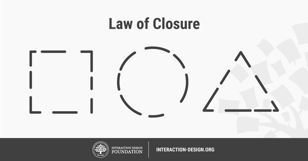
Closure (Reification): Preferring complete shapes, we automatically fill in gaps between elements to perceive a complete image; so, we see the whole first.
Common Fate: We group elements that move in the same direction.
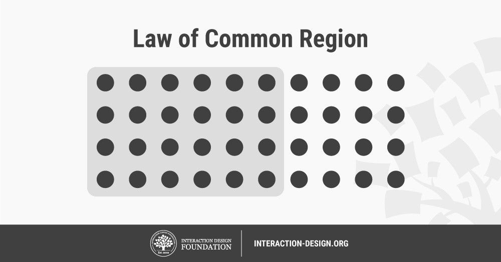
Common Region: We group elements that are in the same closed region.
Continuation: We follow and “flow with” lines.
Convexity: We perceive convex shapes ahead of concave ones.
Element Connectedness: We group elements linked by other elements.
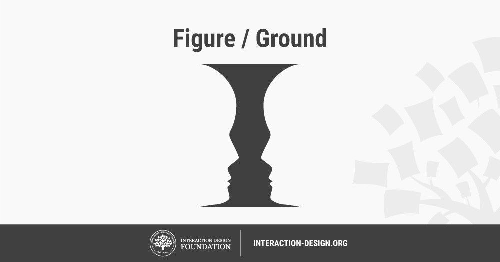
Figure/Ground (Multi-stability): Disliking uncertainty, we look for solid, stable items. Unless an image is truly ambiguous, its foreground catches the eye first.
Good Form: We differentiate elements that are similar in color, form, pattern, etc. from others—even when they overlap—and cluster them together.
Meaningfulness (Familiarity): We group elements if they form a meaningful or personally relevant image.
Prägnanz: We perceive complex or ambiguous images as simple ones.
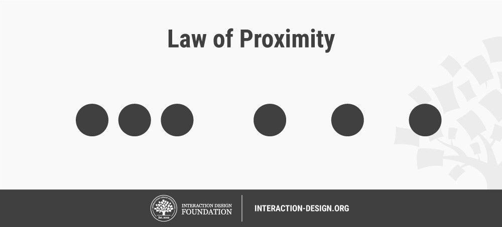
Proximity (Emergence): We group closer-together elements, separating them from those farther apart.
Regularity: Sorting items, we tend to group some into larger shapes, and connect any elements that form a pattern.
Similarity (Invariance): We seek differences and similarities in an image and link similar elements.
Symmetry: We seek balance and order in designs, struggling to do so if they aren’t readily apparent.
Synchrony: We group static visual elements that appear at the same time.
Gestalt Principles are in the Mind, Not the Eye
The Gestalt Principles are pivotal in UX design, notably in interfaces, as users must be able to understand what they see—and find what they want—at a glance. A good example are the principles of proximity and common region, as seen in the IDF landing page, below – where colors and graphics divide the page into separate regions. Without it, users will struggle to make associations between unrelated clustered-together items, and leave. For designers, the true trick of Gestalt is never to confuse or delay users, but to guide them to identify their options and identify with organizations/brands rapidly.
What are the 5 principles of Gestalt?
